Rocket Pimp Dev Diary 2: New Map
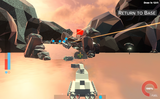
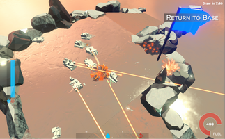
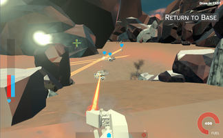
Hello everyone! Welcome to dev diary 2, which is about a new content update that introduces an entirely new map!
Let’s get straight to the point: The previous dark cityscape battle map of the initial pre-alpha release wasn’t very functional in terms of game mechanics. The reason is I’ve been developing the game on a small test map for a long time. When I decided to add the much larger map, I focused on making it looking as cool as possible with my meager skills, mostly ignoring actual gameplay. It turned out to have a large number of irrelevant areas, whereas in practice most fighting would be concentrated to the bases. The bots didn’t know how to access the roof tops. Another failure was the art style which was probably too dark for this game, especially for the currently unfinished vehicle graphics.
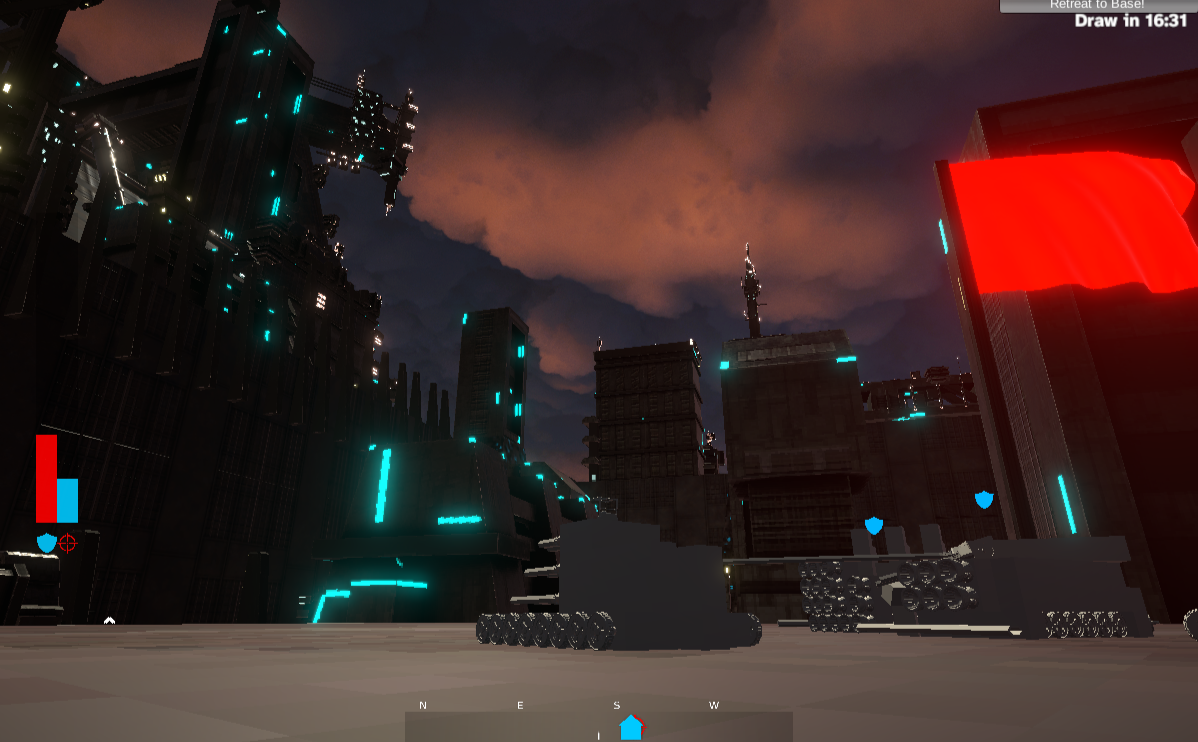
Secondly, this is not something I’ve dreamt up. I measured that people (in aggregate) specifically exited quite soon when they reached the battle stage via Unity Analytics. There were surely additional reasons for that, including bugs, unclarity with respect to how to play, and so forth. However, I’ve decided to try to settle the art style for maps first above all. If you want to give your input you’re highly encouraged to submit the Google Forms questionary or join my Discord, all of which can be accessed from the build screen in the game.
Without further ado, let’s introduce the new map, which is based on a much simpler and lighter art style. I’m not sure if it’s ice, snow, or what:

The map consists of a single circular layout around big central rock, with the two bases on opposite ends. Easy to navigate, also for the very dumb bots! This means you will see a lot more fighting going forward, letting you actually play the game in a more sensible manner. Here is an overhead screen capture from within the Unity editor; not made for being pretty:
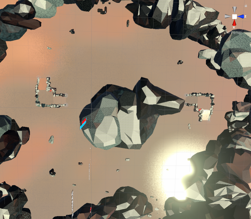
It’s worth noting you can actually zoom out quite a bit while playing the game with the mouse wheel, in case you would rather play a third person shooter than a first person shooter. Camera control isn’t perfect yet - especially on these WebGL builds unfortunately. I’m planning to offer downloadable Windows builds pretty soon, that behave much better and look snappier than the compressed-to-death WebGL graphics.
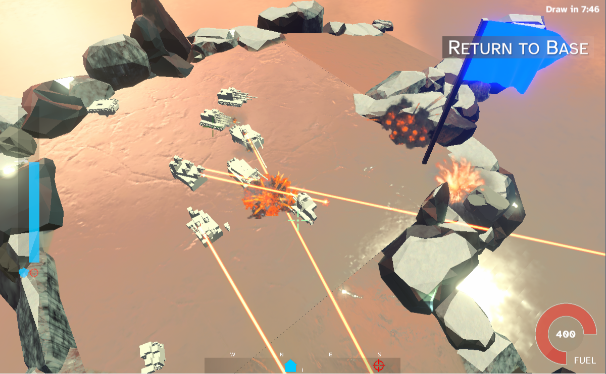
So, I would encourage people to try this and tell me what you don’t like about it and what you think could be decent improvements. To be fair, the game is much more playable in Europe currently due to ping, so I apologize ahead of time if you’re from America or Asia - it’s too early for me to start adding stuff like a geolocation system to the backend.
This update also features some other bug fixes and small improvements:
- Aim reticles have been improved a bit
- Game flow has been reworked - you get put into a tutorial the first time you play
- Return to base and Respawn buttons are a bit more helpful
- Out of memory crashes should have been reduced significantly, if not entirely
- Added some anti-clipping code to camera so it tries to go around world geometry in the way, not perfect yet
- You now get raised to the ground if you somehow sink into it due to Unity’s physics engine
- Cut WebGL download size by about 25% (not really sustainable to build a game on however, hence upcoming native Windows build)
- Added a Christmas tree
That’s all for this dev diary. Thank you all for reading this far! I am eager to hear your feedback!
Petter

Rocket Pimp
Fast paced Minecraft:y vehicle building & fighting game
| Status | In development |
| Author | Xilera |
| Genre | Shooter |
| Tags | Multiplayer, Physics, PvP |
| Languages | English |
More posts
- Fixed broken serversDec 08, 2021
- What I wish I had known about gameplay programming 20 years agoNov 26, 2021
- RocketPimp: Minor build screen fixNov 24, 2021
- RocketPimp: Build screen tweakNov 19, 2021
- Rocket Pimp Dev Diary 1Nov 17, 2021
Comments
Log in with itch.io to leave a comment.
I like the light and the zoom function!